From the Founder – Interest Rates & the Stock Market

As you might imagine, there is a lot to keep up with when trying to follow the world of finance and the markets. Our team uses a number of different methods to stay informed, and recently, two of my preferred methods meshed together beautifully.
While reviewing a recent article, I came across the chart below:
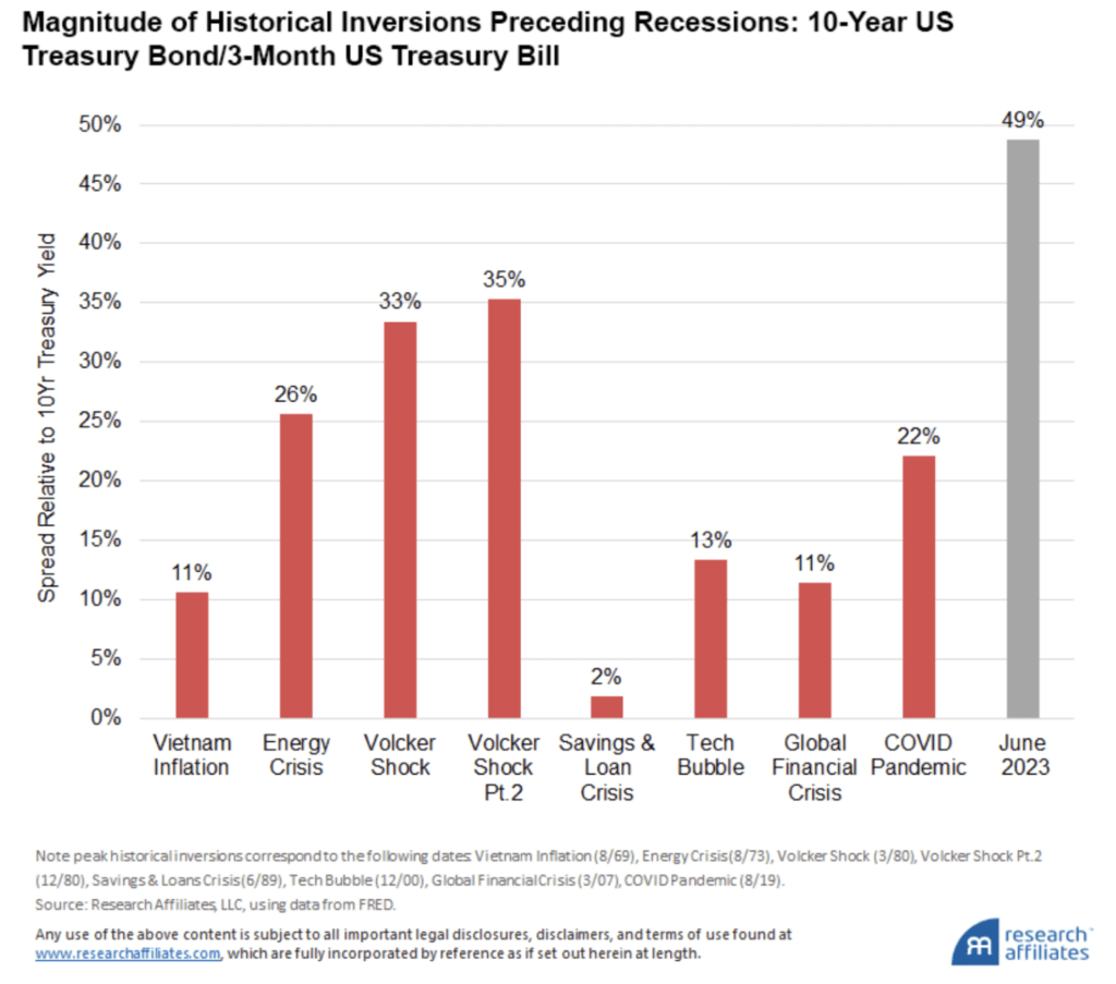
This chart shows the last eight times that the yield curve inverted and was followed by a recession. Now, if you read ‘yield curve inverted’ and said, “huh?!?” I’m sure you’re not alone!
A yield curve inversion is a fancy way of saying that the rate of return on bonds has flipped and is the opposite of normal. Normally, you would think that the longer you’re willing to invest your bonds, the higher the interest rate would be. Makes sense, right? It works the same way with bank CDs.
And normally, this IS right. But an inversion is when everything is backwards. So with a yield curve inversion, you earn higher rates on shorter term bonds. Pretty weird, right?
So what could cause this? I suspect entire classes have been taught on this topic, and I don’t pretend to be the expert; but I think of it this way: if investors are willing to take less and less return to lock up their money for a longer and longer amount of time, that tells us that they’re worried about having that money somewhere riskier like in the stock market.
Which brings me all the way back to my first point – two methods meshing together. When I saw the chart above, I immediately remembered sitting in a conference in Atlanta a number of years ago listening to an economic guru. He stated that everyone has all kinds of ways of trying to predict the stock market, but the only single one that has proven to be consistently true is that stock market drops have historically followed a yield curve inversion.
So what exactly is this chart saying? It is showing that the yield curve as of June was more inverted than each of the last eight times it has happened since 1969!
Of course, that doesn’t guarantee anything; but if we believe this theory, what does it mean? It means that the likelihood of a recession in 2023 or 2024 is increased, and that means that some kind of stock market risk may be increased as well.
If you’ve been reading my comments for a while, you know that I don’t pretend to be able to predict the stock market. To me, seeing charts like this are just another reason why having such a diverse allocation for your nest egg is so vital.
Part of a successful retirement plan is finding ways to avoid losses on your nest egg as much as possible. By divvying your nest egg up into many different baskets, you are doing what you can to protect yourself from large losses.
So regardless of what the financial media is shouting at you today, as long as you’re diversified, don’t sweat it. We will stick to your plan and stay focused on helping you accomplish your retirement goals and dreams.

Learn more about your current financial status and how you can achieve your retirement goals with our ‘No Obligation, No Cost’ Five Step Retirement Review.
Our financial planners have wide knowledge in South Carolina Retirement System as well as experience in retirement planning. sc tax rebate, etc. Contact us today!
Securities offered through Arkadios Capital, Member FINRA/SIPC. Advisory services offered through Arkadios Wealth. Preservation Specialists and Arkadios are not affiliated through any ownership
Ready to Take The Next Step?
For more information about any of the products and services listed here, schedule a meeting today or register to attend a seminar.