From The Founder: Taxes in America

Since April is often considered ‘tax month,’ I thought I would share a few tax charts that I found interesting. One of the opinions I’ve heard a lot in recent years is that our tax system is not progressive enough and that wealthy Americans are not paying their ‘fair share.’ Let’s see what the following three charts have to say about that:
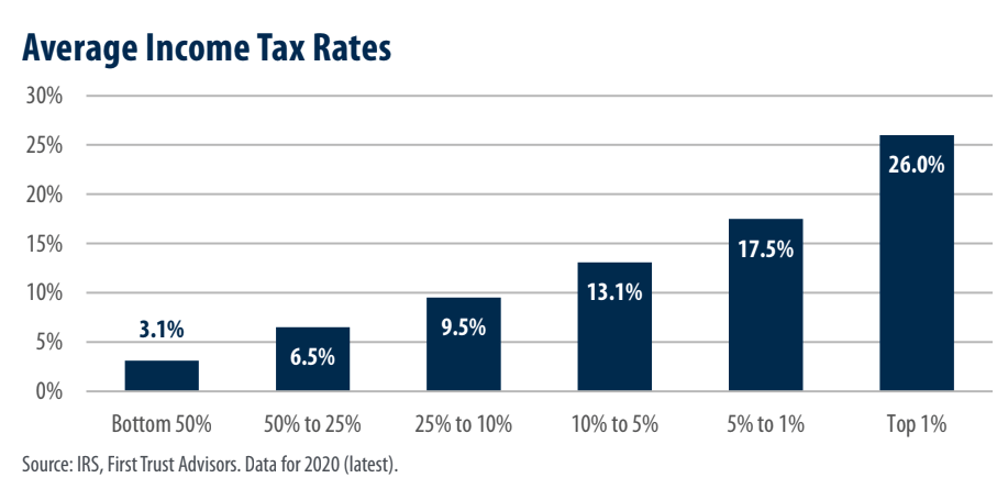
Our first chart this month shows average tax rates for different income levels in 2020, which is the most recent data available through the IRS. I thought this was an insightful visual to see the progressive nature of our current code. For example, those in the top 1% (with an adjusted gross income of $548,336 or higher) paid an average of 26% of their income for federal taxes. Meanwhile, those in the bottom 50%, (earning $42,184 or less) had an average income tax rate of 3.1%
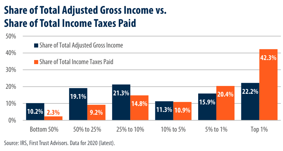
The second chart shows the share of total income earned versus the share of total taxes paid, which is similar information to the last chart, but does make some interesting points. The comparison from this chart that I find most fascinating is if you total up the bottom 95% of taxpayers and compare them to the top 1%. The top 1%, which is around 1.6 million households, and make 22.2% of the income, but they pay almost twice that percentage, 42.3%, of the federal tax burden.
The bottom 95% makes up around 151 million households who earn 64.8% of the income and pay 40.5% of the federal taxes. This means that the top 1% is paying more taxes than the entire bottom 95% combined.
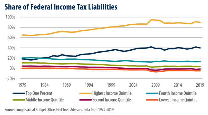
The final chart shows how the percent of total taxes has changed for different groups going back to 1979. This is a great visual to show that our tax code has become more and more progressive over the last forty years. For example, the percentage of taxes paid by the top 20% has increased from 65% to 89.7%. The lowest 20% has dropped from -0.1% to -4.8%, and the second lowest 20% has dropped from 4.2% to -1.6%. Yes, that means that the lowest 40% not only isn’t paying income taxes, but is receiving additional income.
So, what does all of this mean? On the one hand, these charts clearly show that our tax code is already very progressive. On the other hand, I don’t know about you, but if someone is making millions of dollars a year, I’m not exactly crying over their tax bill. Like so many things in life, it seems to me that we need to find a balance.
Since we’re in an election year, these charts do bring to mind what tax experts like Ed Slott and David McKnight have been saying over the last few years. Our spending as a country is so out of control, that we could theoretically increase taxes on the wealthy to 100%, and it wouldn’t come close to balancing our budget. So if politicians are making promises this year and saying their solution is to have the wealthy pay for it, I would be very curious to check their math – if in fact they’ve actually done any.
I hope you found these charts as interesting as I did. They show why our advisor team continues to spend more and more of our time with our clients planning and strategizing on how to reduce your overall tax burden now and in the future. If you have any questions on your tax plan, don’t hesitate to reach out to us.

Learn more about your current financial status and how you can achieve your retirement goals with our ‘No Obligation, No Cost’ Five Step Retirement Review.
Our financial planners have wide knowledge in South Carolina Retirement System as well as experience in retirement planning. sc tax rebate, etc. Contact us today!
Ready to Take The Next Step?
For more information about any of the products and services listed here, schedule a meeting today or register to attend a seminar.